 技术员
技术员 CSS实现翻牌特效
效果展示:

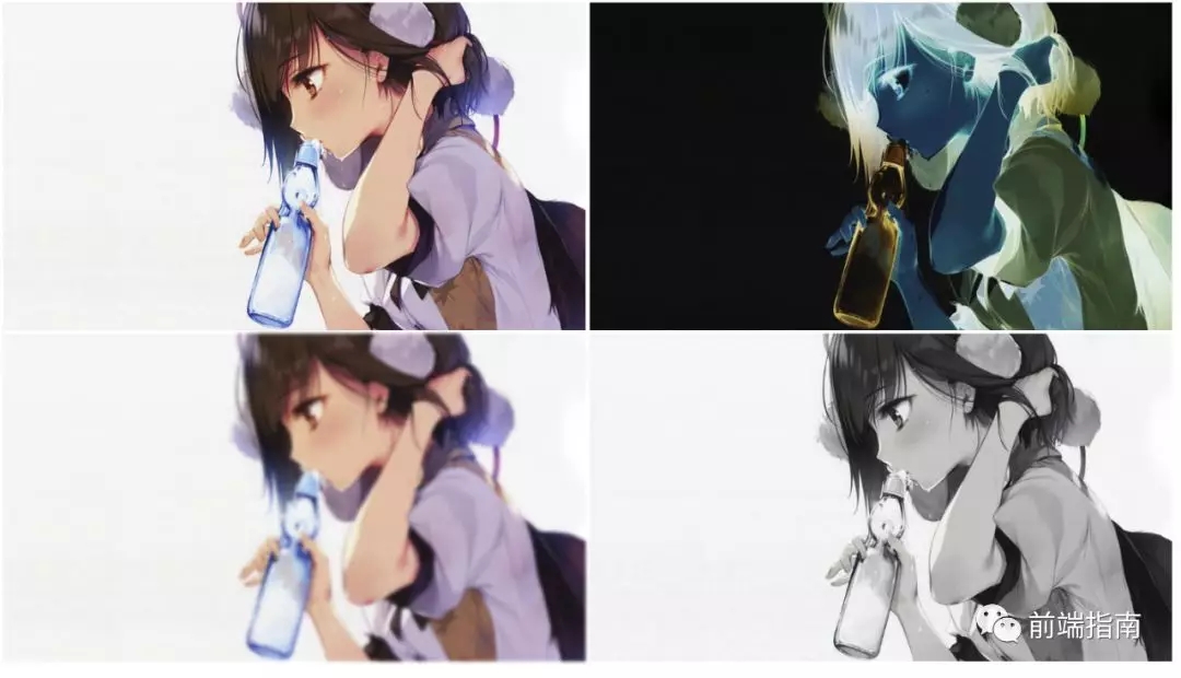
效果用图:


源码展示:
<!doctype html>
<html>
<head>
    <meta charset="utf-8">
    <title>纯CSS翻牌图片特效</title>
    <style>
        * {
            padding:0;
            margin:0;
        }
        body {
            background:#333;
        }
        ul,li,ol {
            list-style-type:none;
        }
        a {
            text-decoration:none;
        }
        img {
            width:250px;
            height:400px;
            display:block;
            /*去除多余边框*/
        }
        #content {
            width:1200px;
            margin:50px auto 0;
        }
        #content ul {
            position:relative;
        }
        #content .bar li {
            width:250px;
            height:400px;
            float:left;
            margin-right:30px;
        }
        #content ul li a {
            width:250px;
            height:400px;
            display:block;
            position:relative;
            /*远近度*/
            perspective:400px;
            transition:all 1s;
        }
        #content ul li a>div {
            transition:all 1s;
            /*背面不可视*/
            backface-visibility:hidden;
        }
        #content ul li a:hover .forward {
            transform:rotateY(-180deg);
        }
        .tips {
            width:250px;
            height:400px;
            color:#fff;
            background:linear-gradient(#333,#666);
            transform:rotateY(180deg);
            transition:all 1s;
            position:absolute;
            top:0px;
            left:0px;
        }
        .tips p {
            text-indent:2em;
            line-height:1.5em;
            padding:20px;
            font-size:18px;
            font-weight:400;
        }
        #content ul li a:hover .tips {
            transform:none;
            box-shadow:0 0 10px 5px pink;
            border-radius:10px;
        }
    </style>
</head>
<body>
<div id="content">
    <ul class="bar">
        <li>
            <a>
                <div class="forward">
                    <img src="a.jpg">
                </div>
                <div class="tips">
                    <p>快来啊 !!!小哥哥</p>
                </div>
            </a>
        </li>
        <li>
            <a>
                <div class="forward">
                    <img src="b.jpg">
                </div>
                <div class="tips">
                    <p>快来啊 !!!小哥哥</p>
                </div>
            </a>
        </li>
        <li>
            <a>
                <div class="forward">
                    <img src="c.jpg">
                </div>
                <div class="tips">
                    <p>快来啊 !!!小哥哥</p>
                </div>
            </a>
        </li>
        <li>
            <a>
                <div class="forward">
                    <img src="d.jpg">
                </div>
                <div class="tips">
                    <p>哈哈哈哈 !!!是不是翻过来很失望</p>
                </div>
            </a>
        </li>
    </ul>
</div>

</body>
</html>